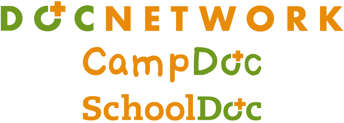
ANN ARBOR, MICHIGAN, February 12, 2019 – We are excited to launch a new look for DocNetwork that communicates a common visual identify across brands: DocNetwork, CampDoc and SchoolDoc. Our new logo design retains the visual elements and familiar color pallet that reflect our origin, but emphasizes our forward-thinking mindset and growth into new categories.
So why change you might ask? Here is a look at the journey we have taken.
Our first logo for CampDoc.com was created when the company launched in 2009. It was unique, and playful, and the Stoobs font resembled something fun and “campy” never before seen within the technology space. We were forging a new path for electronic health record software for camps, but never wanted to lose the roots of who we were as a startup. We also introduced an identity for the brand, with our friend the CampDoc toon…I’m sure you’ve seen him around a few places!

But with our market growing, and as we entered new categories, we needed to evolve. As we grew, we developed different versions of the logo. However, that meant depending on the website you landed on, you may have had a different experience. Was the “toon” visible or not? Who was DocNetwork.org? What happened to ChildCareDoc.com? Too many questions for us to answer, without a clear message.

With new categories came new audiences and the same old, same old wasn’t working hard enough for us anymore. We needed to tailor the message more specifically to the unique needs of these different audiences.
So today we are starting with the logo.
It uses a bold color palette, featuring the core DocNetwork brand orange and green colors, but still contains the spirit of the original. It’s an evolution, and one that can scale easily, and work better, in many more places.
We also created a unique brand identifier, to provide a cohesive look and feel across all three logos, which we affectionately call the “charge”.
This is the first step in our new branding journey. Over the next few months you may see other branding changes as well. These changes will create a more cohesive branding experience across all of touch points, focusing on delivering creative solutions where the customer, company and community wins.
Your Friends @ DocNetwork

Leave A Comment